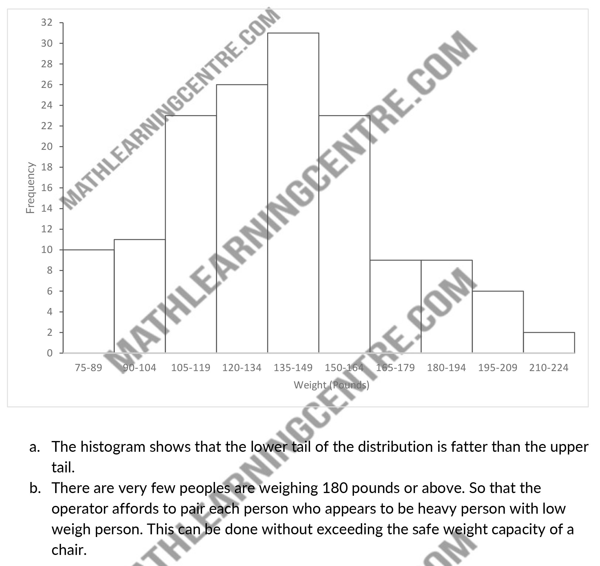
Here is a frequency distribution of the weight of 150 people who used a ski lift a certain day. Construct a histogram for these data.
| Class | Frequency |
| 75–89 | 10 |
| 90–104 | 11 |
| 105–119 | 23 |
| 120–134 | 26 |
| 135–149 | 31 |
| 150–164 | 23 |
| 165–179 | 9 |
| 180–194 | 9 |
| 195–209 | 6 |
| 210–224 | 2 |
- What can you see from the histogram about the data that was not immediately apparent from the frequency distribution?
- If each ski lift chair holds two people but is limited in total safe weight capacity to 400 pounds, what can the operator do to maximize the people capacity of the ski lift without exceeding the safe weight capacity of a chair? Do the data support your proposal?
Solutions

